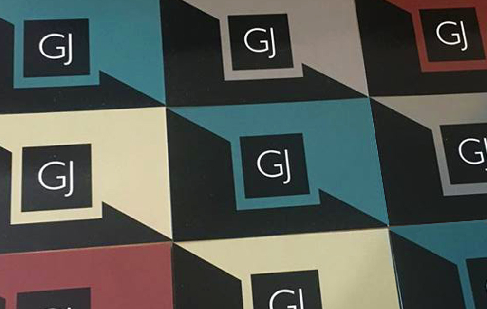
I designed my business cards as part of my final year university project. I wanted a design that I could create a few variations of. The designs are relatively simple using my logo in a black square with a cut into triangle running diagonally through them. I wanted a design that looked clean crisp and relatively minimalistic.
The colours are the colours I could related to at the time of designing. In the future I intend on using some more vibrate colours Which i am gradually incorporating into my branding.

The cards colours compliment each other and can be used to create patters and shapes. When given the choice the teal have always been the most popular for people to take and my personal favourite also.
My personal branding journey started off with an emphasis on the sandy colour but developed to incorporate more of the teal, which adorns my CV and the cover of my portfolio. These colours contrasting against the black help to bring out a depth to the designs.
The rear of the card incorporates a zoomed in abstract gj edge creating a devoting line and then the type sits inline with my name and title offset so the below is centred. The card uses the type face Gill Sans regular and light one of my personal favourites clean typeface with a light quirkiness to it.